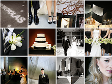
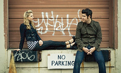
 I love today. We finished the save the dates finally. I am so pleased with the way they came out and can't wait for our guests to receive them. Our kitchen has looked like a Martha Stewart sweatshop for weeks. Now we can have our lives and counters back for a few months until the next maelstrom of design and crafting begins. As much time as these things took, I think we can say we really are happy with the design. Our goal was to create something that was "SoCal cool"...it's sorta Hollister meets Tragic Kingdom album artwork meets letterpress meets Nick + Halli. I was worried the black and orange would be a bit too Halloweeny, but I have not had that gut reaction throughout all the black and orange experience. I love the way the packet works. They scream "us." Now for the commentary this project's learnings...
 1. If you use ribbons on invitations of any type you must really enjoy punishment. Never again peeps. I have made ribbon design choices before but for some reason I failed to remember all the drama that ensues. We solved for it, but lordy it took time and serious attention to detail. We were saved by Zots Clear Adhesive glue dots. They pack some serious adhesive punch. Learn about them.
2. Women- Treat yourself to a pair of amazing scissors. I bought some killer all-steel, seamstress grade Fiskars. I was using some pathetic three-buck Ikea scissors that wouldn't even cut ribbon. These things cut like a hot knife through butter.
3. Photostamps.com custom photo/artwork stamps...like, but not so much in love. Being able to control our the design and tie it into our theme was great, but the stamps themselves are HUGE. They are eating up the front of the envelope. If they were smart they would start offering a smaller size, esp for people who use these on reply cards. I am surprised someone in their product dev department hasn't figured this out. We will save using them again for the commemorative Bizmark von Whiskers stamps.
4. The number one thing that you read about wedding mailings is to hand cancel your envelopes. This is a total scandal with the USPS. They don't do this anymore if you live outside of Mayberry. Even if you do find a post office to hand cancel, they still get routed through the evil post-o-matic sorting machines. Research also shows that the USPS will try to charge brides for this (which is illegal) and sometimes invites get lost. Sorry if your save the date looks kinda chewed up on the outside...at least it is pretty on the inside!
Ps. Paula loves this story about the California State Flag, our design inspiration. The jury is still out on the validity of the story, but regardless, pretty darn funny.


